5 Signs That Your Branding Needs a Refresh (And Why It Matters for Your Business Success)

Brand isn’t what you say. It’s what they feel.
It’s not a logo. Not your color palette. Not the font you paid $300 for.
It’s that instant gut feeling when someone sees your name and thinks:
“Yes. That’s the one.”
Even if you’re not the cheapest. Even if someone else has the same features.
That feeling - that pull - is what great branding creates.
And no, it’s not just about nice visuals. It’s about trust, emotion, and identity.
You might think:
“Really? Fonts and colors boost sales?”
Yes. Because people don’t buy things. They buy how things make them feel.
They want confidence. Belonging. That quiet thrill of choosing right.
Look at Nike. They’re not selling sneakers. They’re selling power, grit, and that “get up and go” mindset.
Apple? They sell status. Simplicity. Control.
And it’s not just the big names.
Smaller brands with a sharp image are winning too - because people remember them, trust them, choose them.
Branding is your silent engine. It keeps working while you’re off the clock. It’s why people stop scrolling. Why they click. Why they come back.
It’s not just decoration - it’s the core of your business.
Look at WHOOP.
They didn’t try to out-feature Apple or Fitbit. They built a brand around high performance, total body-mind sync, and a no-nonsense focus on results.
And it stuck - with athletes, biohackers, and people who want to level up.
That’s what happens when your brand hits the mark.
It removes doubt. Sets the vibe. Backs up your price. And makes you unforgettable.
In this article, I will try to explain when your brand needs a shake-up and why it might be the smartest move you make all year.
What is the look and feel of your brand? Feels like it's outdated?
Picture this – back in 2015, brands were obsessed with glossy gradients, 3D logos, and shadow-heavy fonts. It looked “techy” and “cool” back then. Fast forward to 2025, and everything’s gone flat, clean, and minimalist. Simple sans-serifs, muted palettes, and tons of breathing room are the new normal.
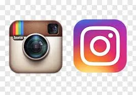
Need an example? Just look at Instagram.
Their old skeuomorphic camera logo felt like a leftover from the early App Store days. In 2016, they made a bold switch – abstract, flat, vibrant. People freaked out at first. But now? That look defines modern UI.
So if your logo still has beveled edges, fancy scripts, or colors straight out of 2012 – your brand might feel like a website people land on by mistake.
Because branding isn’t just about who you are – it’s about how current, relevant, and confident you look.
And your visual style is the first thing that tells the world whether you’ve evolved or been left behind.
Visual styles evolve quickly – what looked sleek and modern a few years ago can now feel dated or even cheap. Consumers are constantly exposed to polished, well-branded experiences, and their expectations follow suit. If your brand still uses outdated fonts, busy layouts, or uninspired color schemes, it sends a subtle but powerful message: this business isn’t evolving.
And perception matters – if your brand looks behind the times, people might assume your product, service, or thinking is too. In competitive markets, you don’t get a second chance to make a first impression.
Take Airbnb. In 2014, the company completely overhauled its brand identity. The old logo was bland, forgettable, and didn’t reflect their global ambition. The new symbol – the “Bélo” – introduced a bold, human-centered design that represented connection, belonging, and simplicity. This wasn’t just visual polish – it aligned the brand with a new level of confidence and scale.
.webp)
Fun Fact: According to Adobe’s research, 38% of users will stop engaging with a website if they find it unattractive or poorly designed. That’s a third of your traffic – gone, before they even read a word.
Want proof? Compare brands in your niche:
- A modern brand often features clean typography, generous white space, and a mobile-first layout.
- An outdated brand might rely on cluttered layouts, serif-heavy fonts, and colors that haven’t aged well.
- Just one glance, and people make assumptions about trustworthiness, quality, and relevance.
Audience Disconnect
Your brand doesn’t exist in a vacuum – it lives in the minds of the people you want to reach. And those people change. Their values, aesthetics, humor, and even the platforms they use evolve over time. If your branding doesn’t keep up, it slowly stops speaking their language.
This disconnect creates friction. What once resonated might now feel tone-deaf, irrelevant, or just plain boring. That’s when you start losing attention, trust, and eventually – sales.
When your audience evolves, your brand has two choices: evolve with them – or fade out.
Example:
Old Spice nailed this shift. Once seen as a “dad brand” stuck in the past, they flipped the script. Instead of chasing their old demographic, they rebranded with absurd humor, over-the-top masculinity, and viral creativity – targeting a younger, meme-savvy audience.
The result? Explosive brand awareness, a massive spike in sales, and a completely new fanbase.
Fun Fact: According to HubSpot, 64% of consumers say shared values are the main reason they build a relationship with a brand. If your brand feels out of touch, it loses that emotional glue.
And the numbers back it up: after Old Spice launched its rebrand, sales reportedly increased by over 100% year-on-year in the months following the campaign. That’s the power of relevance.
Inconsistent Brand Experience
- Let’s say someone lands on your website – clean, modern, minimal. Then they jump to your socials – suddenly it’s loud, cluttered, totally different energy. Next, they get an email that sounds like it came from a bank.
- That’s friction.And friction kills trust.
Great brands feel the same everywhere. Not identical – but aligned. The tone, the visuals, the way things move, the rhythm of your messaging – it all flows. Colors, layout, type, imagery, even the way you speak – it’s one cohesive experience.
If you’re switching styles like outfits, your audience won’t know who they’re dealing with.
Fun Fact: Lucidpress found that consistent branding across all platforms can boost revenue by up to 33%. That’s not just because it looks good – it’s because it creates cohesion in the customer journey. When the vibe is right everywhere – from landing page to checkout to post-purchase email – people move faster, hesitate less, and remember you longer.
Market Positioning Shift
As your business grows, what you offer – and who you offer it to – changes. You evolve. But if your branding stays stuck in the past, there’s a disconnect. Maybe you’ve expanded your product line, moved upmarket, or shifted focus to a new audience.
If your identity still reflects the “old you,” you’re anchoring yourself to the wrong story.
When your brand doesn’t reflect where you’re headed, it slows momentum. People can’t follow the shift if the signals aren’t clear – design, messaging, tone – all of it needs to align with your new direction.
Look at Dunkin’. They were known for doughnuts. But when they expanded into coffee culture, convenience, and lifestyle, the name Dunkin’ Donuts no longer fit.
So they dropped the “Donuts”, revamped the visual system, modernized their look, and leaned into their broader identity.
The move felt simple – but it was strategic. And it worked. New audience, new relevance, stronger market presence.
Post-rebrand, Dunkin’ reported a noticeable increase in sales and foot traffic, particularly for coffee and beverage categories.
And they weren’t alone – market data consistently shows that companies who align branding with evolved positioning see higher customer engagement and stronger brand clarity.
Because when your brand reflects who you are now – not who you used to be – people get it faster, trust it deeper, and buy in more often.
Growth has Stalled
When growth slows down – fewer leads, flat sales, low engagement – it’s often a sign your brand has stopped resonating. The market moves fast. New players enter, trends shift, customer expectations evolve.
If your brand still looks and sounds the same as it did years ago, people may stop noticing you altogether.
A brand refresh can reignite attention. It shows the world you’re evolving, staying sharp, and still worth their time.
Burberry is a perfect case. In the early 2000s, the brand was seen as outdated – more old money than modern luxury. But through a full rebrand – cleaner visuals, modern design direction, and fresh campaigns – they flipped the narrative.
From 2001 to 2010, their market value jumped from £2 billion to over £7 billion. The brand became desirable again – to a whole new generation.
Fun Fact: According to HubSpot, brands that update their identity strategically see measurable gains in leads, conversions, and loyalty. Why? Because strong branding renews relevance – and relevance drives results. If your brand feels fresh, people re-engage. And that momentum creates space for growth again.
Why Branding Refresh Matters: Direct Impact on Performance and Recognition
Let’s be honest – if your brand feels off, growth slows down. People scroll past. Customers stop engaging. A refresh realigns how you look, sound, and feel with where your business is headed.
Customer Loyalty – People Stay When the Brand Still Feels Right
If your visuals and tone don’t match who your audience is today, they’ll disconnect. A modern, relatable identity keeps you relevant – and keeps them coming back.
Sales Growth – Clarity Closes Deals
Outdated brands create doubt. Updated brands cut through noise. When your message, visuals, and vibe all align, people get you – and convert faster.
Market Position – Strong Brands Lead
When you look the part, people trust you more. A sharp brand tells the market: we’ve leveled up. We’re not who we were – and we’re not like the rest.
Refreshing your brand isn’t cosmetic. It’s a signal. One that gets you noticed, remembered, and chosen – again.
Checklist for Evaluating Your Branding
Ask yourself honestly:
- Does your visual identity still reflect who you are – or who you used to be?
- Would someone recognize your brand instantly across your website, social media, and packaging – or does it feel inconsistent?
- Do your colors, fonts, and layout still feel modern – or slightly dated?
- Does your brand stand out visually in your market – or blend in with everyone else?
- Are people confusing your brand with a competitor?
- Has your target audience changed – but your branding hasn’t?
- Do you cringe a little when you send someone to your website or Instagram?
- Is your brand memorable after one interaction – or forgettable without context?
- Are your current visuals helping or hurting conversion (clicks, leads, sales)?
- When was the last time your design got a serious update?
👉 Score yourself:
- 0–3 “yes” answers: You’re probably in good shape.
- 4–6 “yes” answers: You’re losing opportunities – time to assess.
- 7+ “yes” answers: It’s time. Your brand needs a refresh.
If you’re starting to outgrow how your brand looks, sounds, or shows up – that’s your signal.
We help businesses align their identity with who they’ve become (and where they’re headed).
Let’s start with a quick, honest brand audit – free of charge.